Frame Images
Frame images are a way to stylize the panels and buttons in your user interface with an image. Frame images use a technique called 9-slice scaling to resize the image to fit any size panel or button in a way that retains the original look of the image.
This is done by slicing the image into nine segments: four corners, four edges and a center. The corners keep their original size, while the edges and center can stretch to fill the available space.

See the Shop example to see this feature in action.
Example
The following code example makes three buttons from the same frame image, but with different widths:
ImageButton(frameImage=@panel.png, width=10, height=5) { }
ImageButton(frameImage=@panel.png, width=20, height=5) { }
ImageButton(frameImage=@panel.png, width=30, height=5) { }
This is the result of the above code:
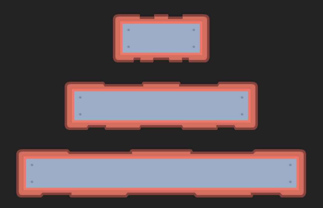
This image is from the free Kenney Adventure UI Pack. Visit Kenney to find more free assets for your games!
Using frame images
Frame images are supported by Panel and Button elements.
Use the frameImage parameter to specify the frame image for your UI element.
Typically, you would use the ImagePanel and ImageButton variations of these elements,
as they remove some default styling so your frame images can be seen clearly.
pub game fn World.Main() {
    Content {
        ImagePanel(frameImage=@dialog.png) {
            HStack {
                "Buy a Chicken"

                ImageButton(frameImage=@button.png) {
                    "Pay 50 coins"
                }
            }
        }
    }
}
The ImagePanel and ImageButton variants remove the shadow, backgroundColor and hoverColor from the default styling,
as these sometimes clash with your frame images.
If needed, you can re-enable these manually by specifying them in the element's parameters.
Frame size
Frame images are sliced into nine segments: four corners, four edges, and a center.
The four corners and four edges are called the frame, while the center is called the fill.
The frameRatio determines the size of the frame relative to the size of the image.
ImageButton(frameImage=@button.png, frameRatio=0.2) {
    "Pay 50 coins"
}
Specifying both width and height
Specify two values in a Vector like frameRatio=@(0.2, 0.1) to separately control the width and height of the frame.
Given a frameImage of width and height 100px, this is how frameRatio=@(0.2, 0.1) would be interpreted:
- The first value
0.2multiplied by100pxmeans the frame will be20pxon both the left and right sides. - The second value
0.1multiplied by100pxmeans the frame will be10pxon both the top and bottom sides.
Specifying only one dimension
When you specify only one number, e.g. frameRatio=0.33,
the size of the frame is set to be the same for all four edges,
calculated from the shortest side of the image.
Give a frameImage of width 200px and height 100px, this is how frameRatio=0.33 would be interpreted:
- The shortest side is
100px, multiply that by0.33and the frame will be33pxfor all four edges.
Default frame ratio
By default, the frame ratio is set to 0.333333, effectively one-third of the shortest side of the image.
The default one-third frame ratio works out-of-the-box for many images found in asset packs,
as it is normally matches how the designer expects the image to be sliced.
Quite often you will not need to change the frameRatio at all.
Just start using an image, see if it looks right, and only then change the frameRatio if needed.
Tiling
Set frameTile=true to use tiling instead of stretching for the edges and center of the frame image.
Tiles are drawn using a rounding algorithm which means every tile is always drawn in full (no partial tiles). This may require stretching of each tile to ensure a proper fit, but it ensures there are no seams between the tiles.
Notes
- The corners of the
frameImageare drawn at their intrinsic size. You can use density specifiers like@2xto make the corners sharper on high-density displays. See Images > Intrinsic Size for more information. - The
sharpparameter onPanelandButtoncan be used to preserve the pixelation of the frame image when scaling it up or down, if you are making a pixel art game. See Images > Pixel Art for more information.